I felt a little lost when I started thinking about the kitchen finishes. I didn’t have a strong desire for anything in particular. Did I want wood cabinets? Colored cabinets? An all white kitchen? There are so many beautiful kitchens out there that I like, I had a hard time deciding which direction I wanted to go in.
So, I spent a lot of time on Instagram and Pinterest to see what I was drawn to which initially seemed to be greige and green cabinets. But, I love green so much, I don’t want to be limited by the color of my cabinets. I know that’s weird to say. But, I want freedom to bring in all different shades of green in decor without worrying if I like it with my cabinets. I also worried that I was drawn to them because they’re trending. And I thought about whether or not they felt right for our house, a center hall colonial (note I would LOVE them in a craftsman or victorian). Not to mention, would I like how much attention they would draw since the kitchen was going to be open?
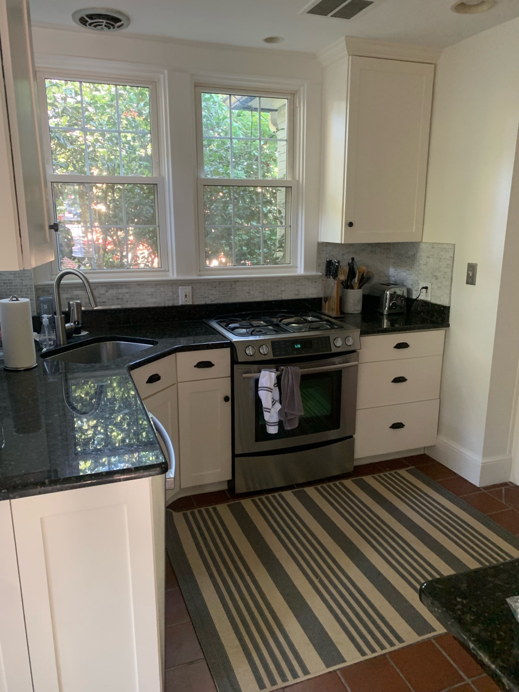
Once I decided against green cabinets (including the island), I went down the greige route which was a dead end. Some of the best advice I got during our renovation was not to lose the things you like in an effort to fix the things you don’t. Our original kitchen featured off-white cabinets and heavily speckled polished black granite counters. While I took issue with the cabinets (they were so shallow our dinner plates prevented the doors from closing all the way) and I wouldn’t have selected that particular black granite, I did like the basic concept of off-white cabinets and black counters. The black counters, unlike the white quartz at our condo, hid all of the crumbs and coffee rings. White cabinets are classic (and don’t show dings as badly as dark painted cabinets). So, I decided to go with an updated black and white kitchen.
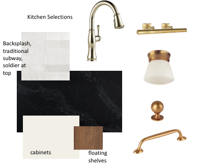
I started searching for black and white kitchens and the designs below by Jean Stoffer proved the be the biggest inspiration. So many black and white kitchen designs I stumbled on came across cold and that seemed to be due to the stark white cabinets and hardware. So, I knew a warm white cabinet would be key and that I wanted to go with brass hardware instead of polished nickel or chrome hardware which felt like the most common pairing I found. But, I did want to incorporate polished nickel so I used that finish on our plumbing fixtures.


On the countertop front, I considered black marble (seen here in Yellow Brick Home’s kitchen), Soapstone, Quartz, and Nero Mist Granite. I really wanted a natural material that I didn’t have to worry about too much but had to be careful of the budget. I didn’t explore black marble much, but found it generally featured more dramatic veining than I was hoping for. I love Soapstone, but it it’s a bit high maintenance and was out of budget. Having had granite, we were comfortable with the maintenance and performance aspects. Plus, it proved to be more affordable than the quartz our contractor had quoted (this was my quartz choice). I selected the exact stones from MSI’s warehouse (as recommended by our contractor) and it was then sent to the fabricator.

To mix things up a bit, since all countertops and cabinets were going to be the same, I decided to go with an ogee edge on the perimeter countertops and a standard eased edge on the island. I got the idea from Emily Henderson’s LA kitchen as seen here.
With respect to the backsplash, I knew I wanted to tile to the ceiling and to soldier the tiles (vertically stacked) right at the ceiling line to mimic the brick detail that surrounded the windows in the former porch (the very space we were turning into the kitchen). I love the shape of traditional subway tile, but didn’t want to go solid white. Budget wouldn’t allow for marble. I did two consults with Melissa of Sanabria & Co, and she recommended Bedrosian Cloe in white which I sampled and loved immediately. It offered varying tones of white, beige, and grey; was irregular but not too irregular and fit the budget.
Ultimately, I settled on the below.
Although I sampled dozens of whites from Benjamin Moore and Sherwin Williams, we ended up going with a stock color from the cabinet maker. Doing so saved us a little bit of money and made the decision easier for me. Our decorative range hood was made on site and painted to match the cabinets. Below is the paint match information for reference.

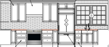
I should also mention that from the start, we planned on frameless full overlay cabinetry. I assumed inset would cost considerably more and would mean sacrificing cabinet space. At the eleventh hour, I switched to inset for the kitchen and I’m SO glad I did. I didn’t do so for the bathrooms (and wish I did) so as to reduce the amount of change at the last minute and save money. But, for us it ended up being approximately $2,000 more to do the kitchen with inset cabinetry and the cabinet maker makes the upper cabinets deeper to compensate for the loss of space. I will note that I’m lucky the cabinet maker we were working with offered inset cabinetry, so it was a relatively painless change. Not all cabinet companies offer inset cabinetry.
I have an in depth hardware post coming soon as I have lots to share on that front. With respect to lighting, we have some recessed lighting (the only room in the house that has it, and I honestly wish we’d skipped it), plus picture lights above the main sink and in the back kitchen (so as to mirror each other). The flush mounts act as our island pendants. A bit unconventional, I know. But, our dining room table sits in front of the island and I wanted to go for a statement chandelier. I knew hanging pendants behind it would get busy. Going with only recessed would have worked, but I wanted a little bit of a statement light above the island. You only see them when you’re in the kitchen (due to the arch separating the kitchen and dining room) and they’re a fun little surprise.
this post contains affiliate links. if you make a purchase using an affiliate link, I may make a small commission at no additional cost to you.


Leave a comment